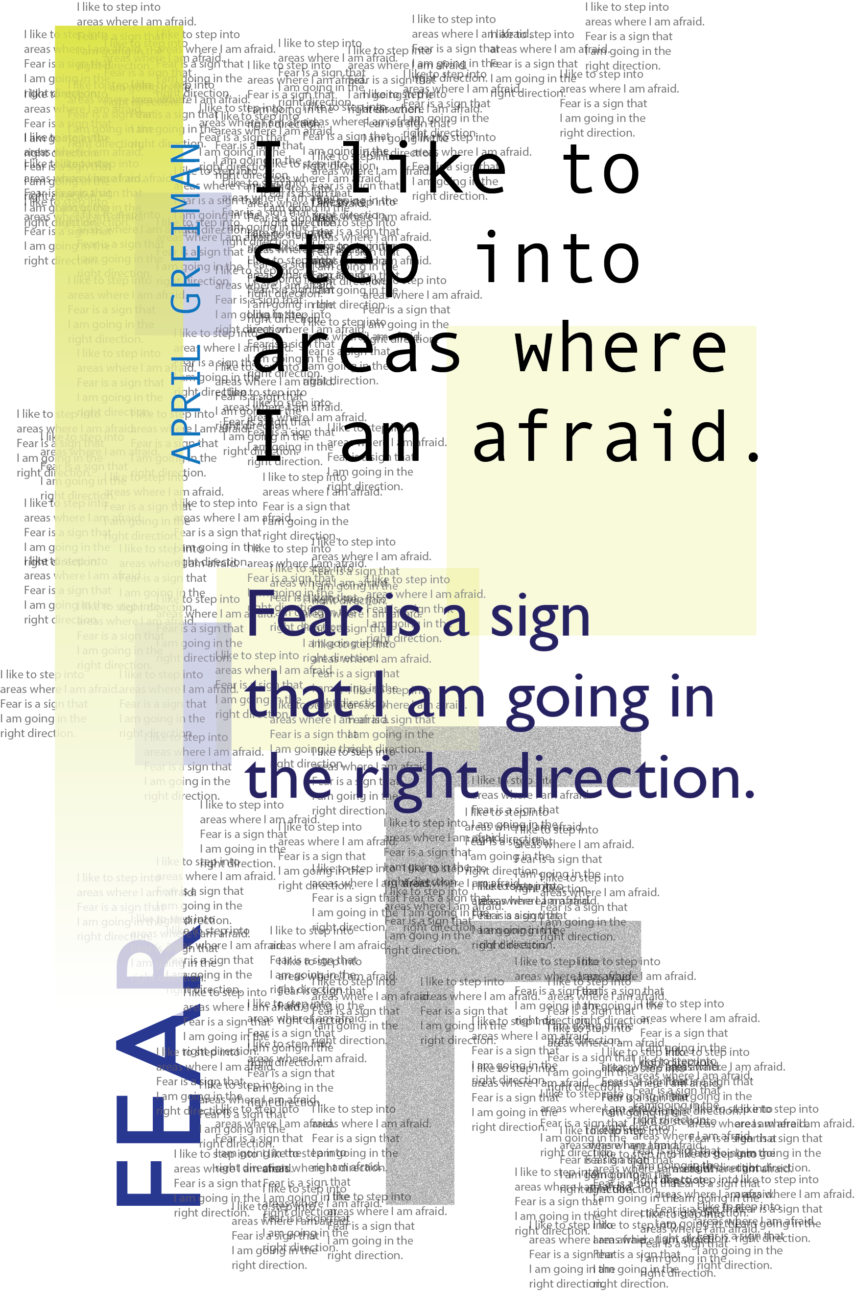
Fairly typical design school assignment: use a quote from a designer and make a poster in their style.
I chose April Greiman based on her quote, and then did research into her visual choices and the style of the period. The original would've been constructed mostly by photocopying and building up the elements layer by layer. While this one was created via computer, I preserved the individual text layering, period-accurate fonts, composition and use of grid, and a similar color palette.
It was fun to really go off the rails and throw everything at this piece, while also figuring out how each element interacts with the others to make a coherent role.
you may also like...
Intern-al AppsUX Design

Sidekick: Anxiety SupportUX Design
Open Source PartyVisual Design

Not My StyleVisual Design

BikeboxUX
Artist - Brand CollabVisual Design
Colorado Fourteenersdata presentation
